I'm a digital designer who enjoys turning ideas into interfaces and visuals. I work across UI and visual
design, often exploring and refining ideas through the process rather than following a fixed path.
I enjoy shaping layouts, experimenting with details, and finding what feels clear and natural through
iteration.
Currently exploring: AI-assisted workflows, and ways to improve the design process.
Location
Tangerang
Experience
3+ years
Focus
UI Design & Social Media Design
Methods
What I do
01
UI Design
Turning requirements into clean, developer-ready interfaces.
02
Interface Systems
Maintaining consistency through reusable components and visual rules.
03
Visual Design
Creating social media graphics, banners, and marketing assets.
Selected work
Things I've built
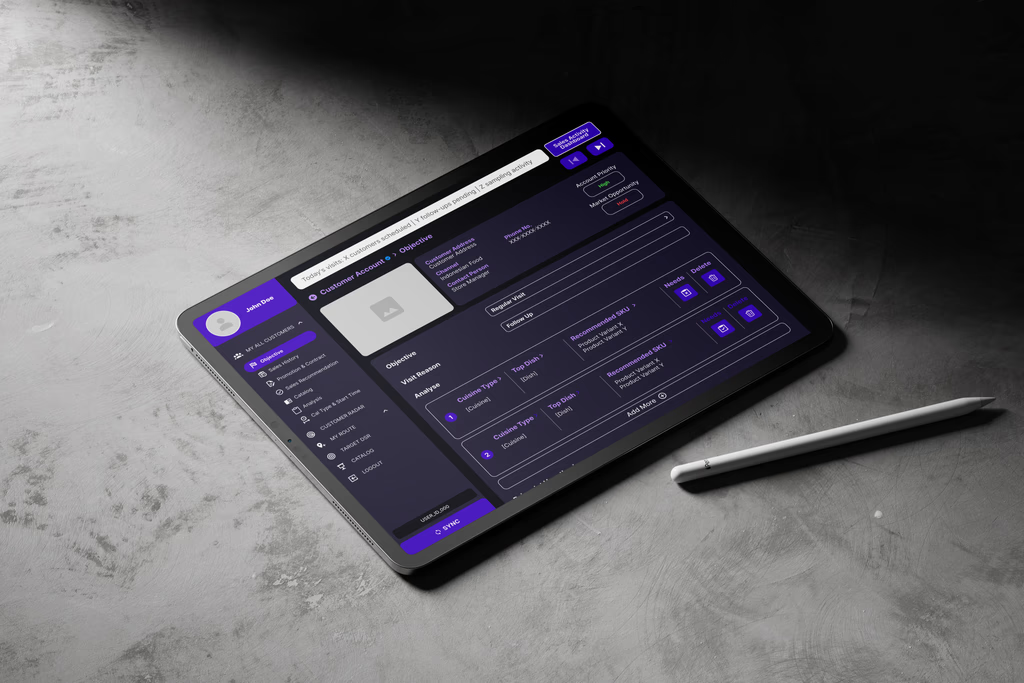
Field Sales Interface Redesign
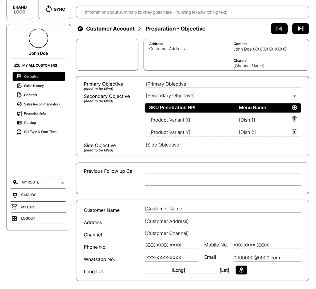
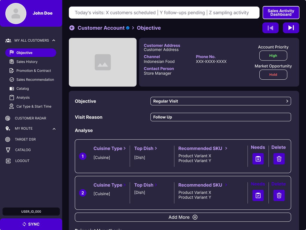
A UI redesign that transformed a dense web-based workflow into a clearer,
iPad-focused experience for real-time sales conversations.
Context: A redesign of a field sales iPad application used during live client
interactions.
Due to confidentiality, this case study highlights one representative example from a broader 50+ screen redesign.
The Challenge
The original application carried many characteristics of a web-based admin interface. Dense layouts and equal visual weight across elements made important information harder to scan during client interactions.
The Goal
Transform the existing experience into a more iPad-native interface with clearer organization, improved
visual hierarchy, and faster information scanning.
My Approach
📱 iPad-native visual system: Adapted layouts, spacing, and components to better suit
tablet interactions.
📁 Information grouping: Organized customer data, objectives, and analysis into
distinct, easier-to-understand sections.
🗂️ Card-based structure: Replaced dense form-like layouts with a card-based approach
to improve visual separation.
🔄 Content flow optimization: Reorganized information into a more logical sequence:
Overview → Objective → Analysis → Recommendation.
📊 Data prioritization: Increased the visibility of important SKUs and insights
through stronger visual hierarchy.
The Outcome
The redesign was approved and moved into implementation. The resulting interface provided a more structured,
tablet-optimized experience designed to support real-time field interactions.
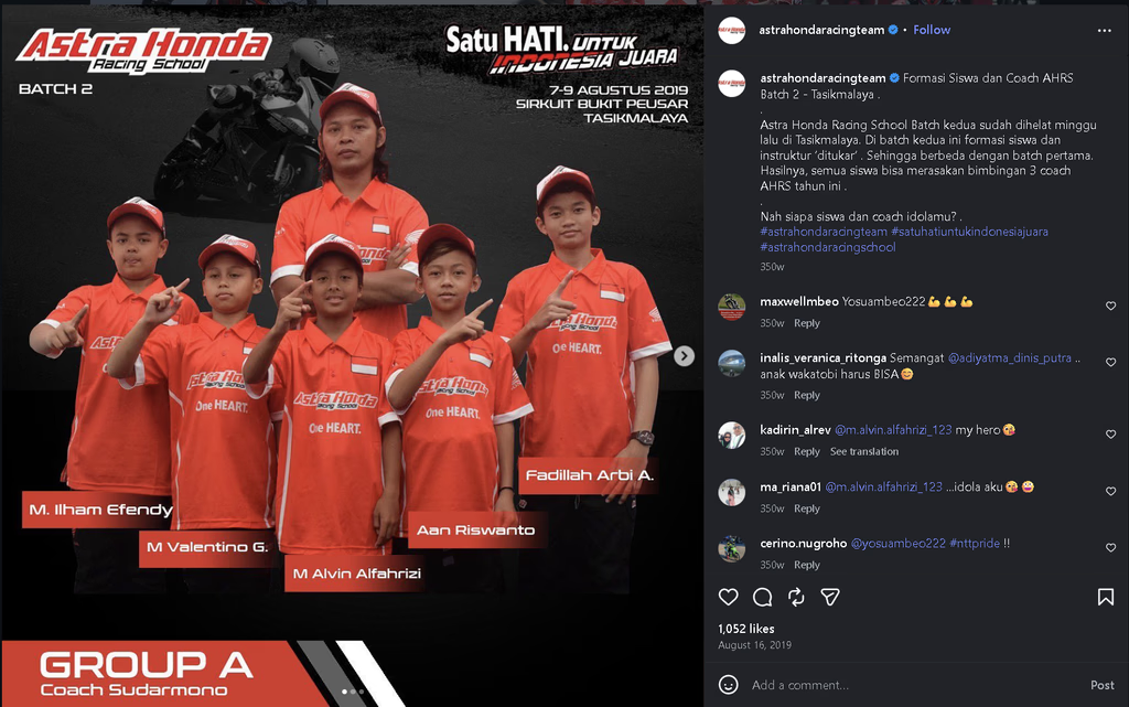
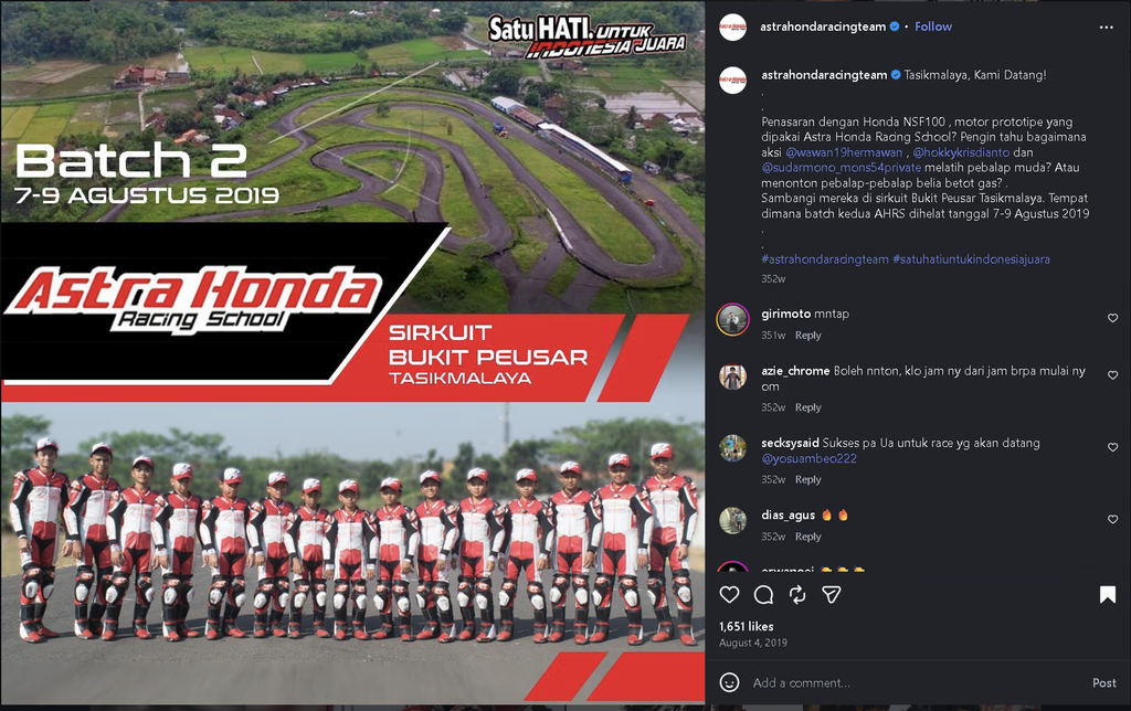
AHRS: Social Asset Design
Role: Graphic Designer
Scope: Social Media Design • Visual Adaptation • Marketing Assets
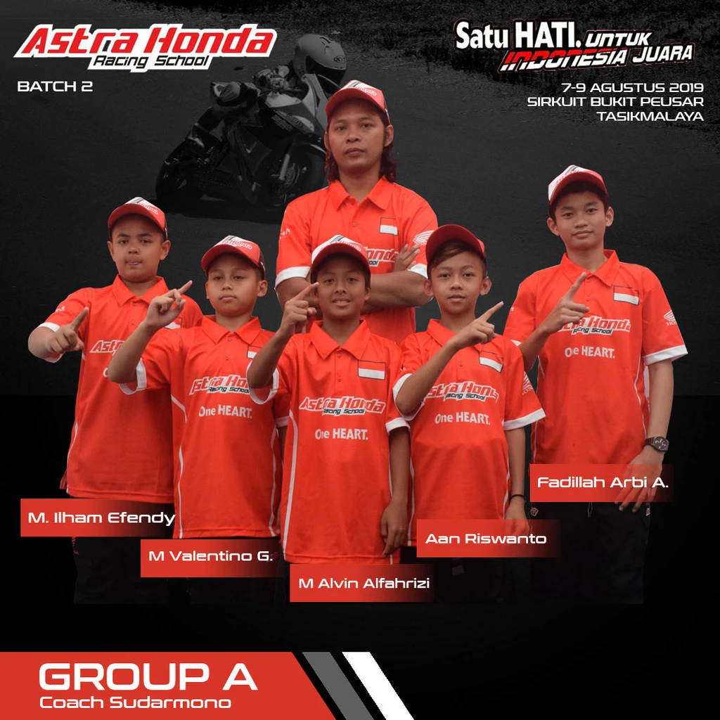
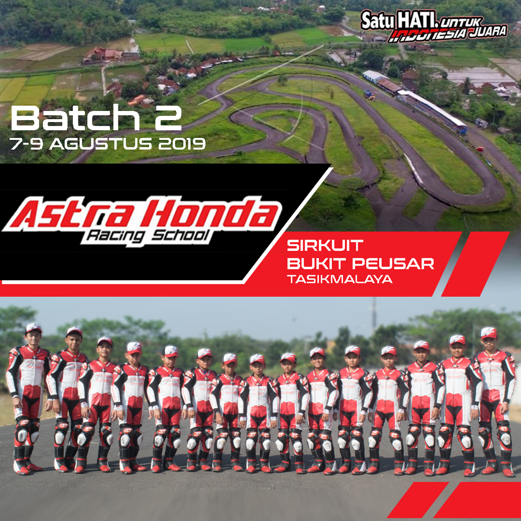
Context: A collection of social media assets created for Batch 2 of Astra Honda Racing
School, published through the official Instagram channel.
The Challenge
The project required transforming racing-related information into visually engaging content while maintaining
alignment with Astra Honda Racing School’s existing brand identity and communication style.
The Goal
Create clear and visually appealing social media assets that effectively communicated event information and
strengthened the overall visual presence of the campaign.
My Approach
The design process focused on adapting brand elements, establishing strong visual hierarchy, and ensuring
consistency across different asset formats.
🏍️ Visual direction: Explored references and translated the racing identity into
dynamic social media visuals.
🎨 Brand consistency: Applied existing colors, typography, and visual elements to
maintain a recognizable identity.
📱 Content adaptation: Designed static posts optimized for Instagram while
considering readability and engagement.
🔄 Iteration and refinement: Refined layouts based on feedback and finalized assets
for publication.
The Outcome
The final assets were delivered and published through the official Astra Honda Racing School Instagram
account as part of the Batch 2 campaign.
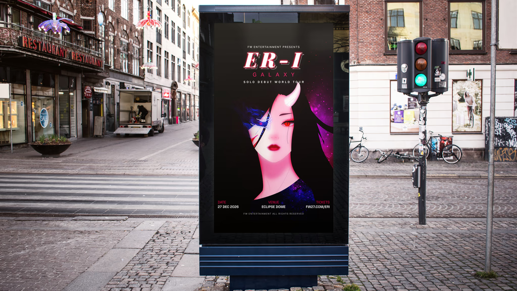
ERI Studios — Brand Identity Exploration
Role: Visual Designer / Art Direction
Scope: Brand Identity • Art Direction • Visual System Exploration
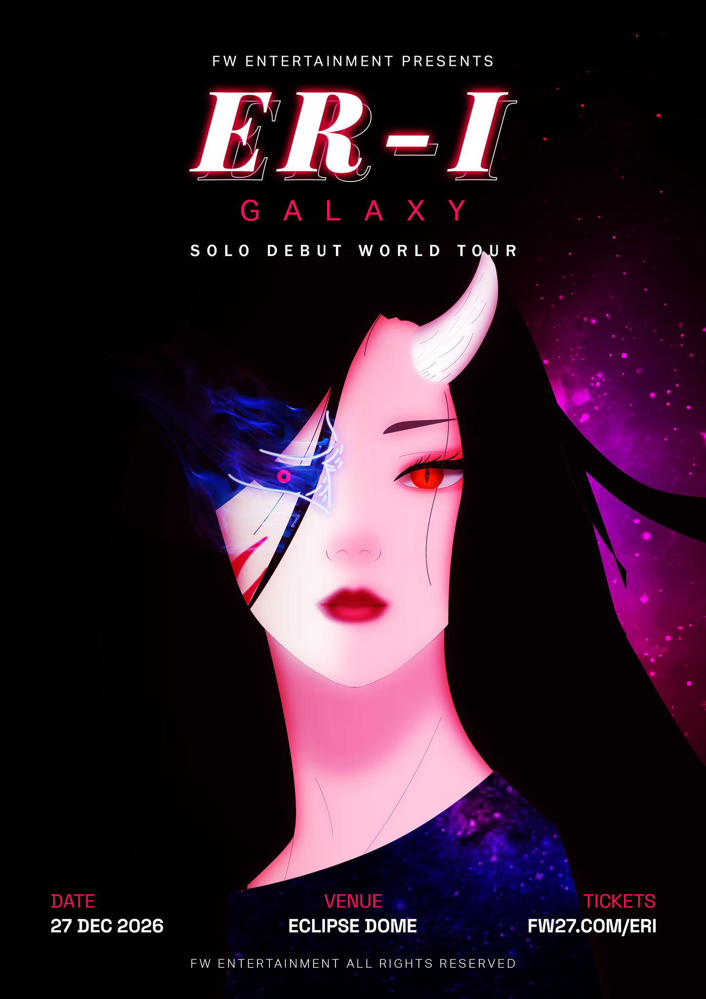
Context: A personal exploration of how a visual identity can maintain its core character
while adapting across different industries.
The project begins with a single character concept, ERI, and expands into three distinct directions: cosmetics,
fashion, and luxury real estate.
Core Identity
The foundation of ERI is the contrast between light and dark.
This duality guides the visual language across every application, influencing color, material, composition,
and atmosphere.
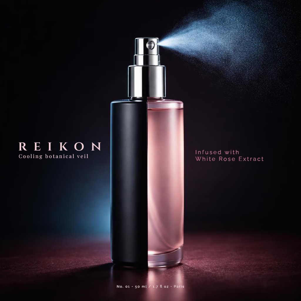
REIKON — Cosmetics
A minimal cosmetic direction where contrast is expressed through matte dark surfaces, soft translucent
materials, and refined product presentation.
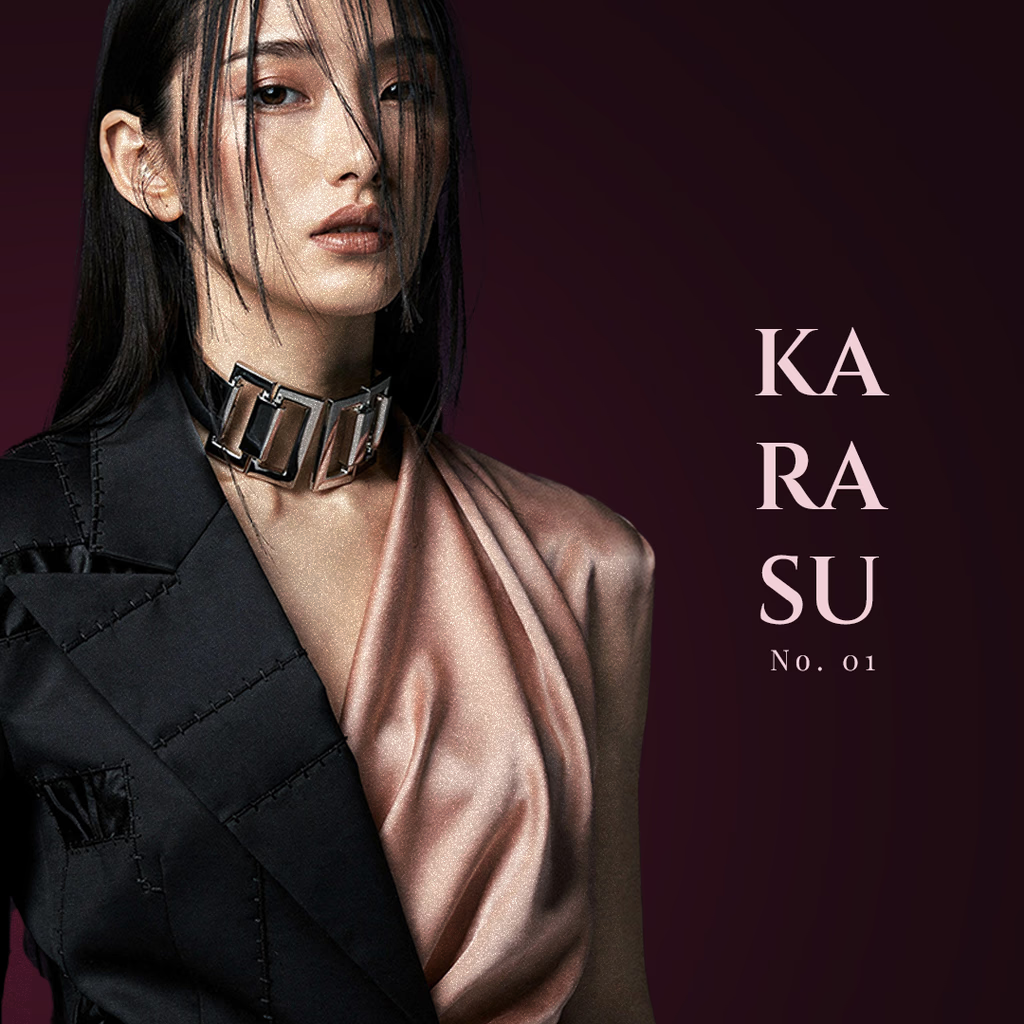
KARASU — Fashion
A fashion concept focused on contrast through silhouette, texture, and material relationships.
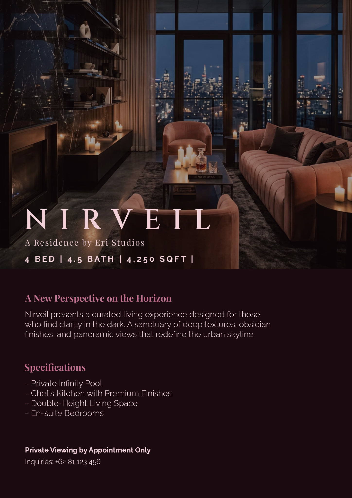
NIRVEIL — Luxury Real Estate
A spatial branding direction where identity is expressed through architecture, lighting, materials, and mood
rather than physical products.
Naming Direction
The names Reikon, Karasu, and Nirveil were selected for tone and emotional association rather than direct
explanation. Each suggests a distinct world while remaining connected to the same visual foundation.
Creative Direction & Production
All visual direction, layout, naming, and branding decisions are original work.
ERI is an original character concept developed as the foundation of this exploration.
Some visual assets were created using AI-assisted tools as part of the production process. The final
direction, composition, selection, and brand application were guided through my creative and art direction
decisions.
Outcome
This exploration demonstrates how a single visual system can evolve into multiple brand expressions while
maintaining a cohesive identity.
Get in touch
Thank you for looking through my work.
I’m a quiet creator who enjoys crafting clean interfaces and thoughtful visuals. If you think my design style
could fit your team, please feel free to drop a message.